
In Data Analytics How Are Dashboards Different from Reports
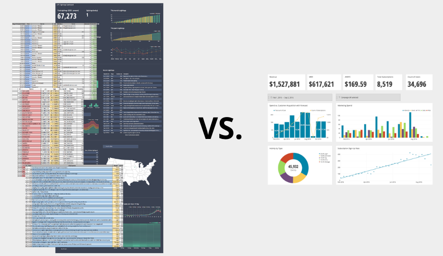
Image Source: Dashboards vs. Reports: How They’re the Same; How They’re Different
Data analytics utilizes both dashboards and reports, each having unique roles:
• Interactivity Feature
Dashboards generally offer interactivity, enabling users to apply filters and modify the displayed data instantly. Conversely, reports tend to be non-interactive and showcase data as it existed at a particular instant.
• Objective
The objective of dashboards is to facilitate swift comprehension and provide immediate insights through graphical representations such as charts and tables. On the other hand, reports primarily consist of comprehensive information and meticulous analysis intended for thorough perusal and rigorous scrutiny.
• Refresh Rate
While dashboards frequently display up-to-the-minute data with continuous updates as fresh inputs arrive, reports undergo generation at predetermined intervals (e.g., daily, weekly) without providing real-time refreshes.
• Audience
Dashboards are often utilized by stakeholders who need to make quick decisions based on current data trends, while reports are prepared for those who require comprehensive data examination for strategic analysis.
The Interactive Nature of Dashboards

Image Source: 42Signals
Dashboards excel in interactivity, allowing users to engage with data through dynamic interfaces. Unlike static reports, dashboards provide:
- Real-time data updates, ensuring the most current information is at one’s fingertips
- Customizable widgets and filters for tailored data exploration
- Drill-down capabilities to uncover underlying data layers
- Visual representations like graphs and gauges that adjust on the fly
By utilizing this interactive tool, individuals can thoroughly explore their data and rapidly obtain necessary information for making informed decisions. Essentially, it allows them to maximize the potential insights and value derived from their data.
Real-Time Data: The Power of Dashboards
Dashboards are pivotal in offering users a real-time view of data and metrics. They facilitate instant access to critical information, enabling decision-makers to:
- Observe current performance indicators
- Quickly detect trends and patterns
- Address issues as they arise, without delay
- Iterate and update strategies promptly
- Empower teams with up-to-the-minute data
This immediacy, inherent in dashboard utilization, transcends the capabilities of traditional reports, which often portray a historical snapshot, rather than the live pulse of an organization’s operations.
Detailed Analysis with Reports

Image Source: Google Support
Reports are instrumental for deep-diving into data. Unlike dashboards that provide at-a-glance insights, reports allow for:
- Comprehensive data breakdowns, facilitating meticulous examination of specific metrics.
- Historical data analysis, uncovering trends and patterns over extended periods.
- Customizable details, tailoring data presentation to the specific needs of the analysis.
- Extensive documentation support, enabling thorough record-keeping and compliance adherence.
A carefully organized and detailed report provides a thorough comprehension that enables companies to make educated, fact-based choices.
The Role of Reports in Historical Data Analysis
Reports serve as crucial tools for historical data analysis, offering a detailed look at data over time. They:
- Provide comprehensive records, facilitating the examination of trends.
- Help in understanding the evolution of metrics and KPIs through detailed, often custom time frames.
- Allow analysts to dissect past performances, revealing successes and shortcomings within organizations or systems.
- Are essential for regulatory compliance, ensuring a historical record of data is maintained for accountability.
- Enable data storytelling by knitting together a narrative of growth, change, or cycles that inform business decisions.
Evaluating the User Experience: Dashboards vs. Reports

When comparing user experience (UX) between dashboards and reports, several factors come into play, including:
• Interactivity
Dashboards generally offer a higher degree of interactivity, enabling users to drill down into data and customize views. Reports are often static documents without these capabilities.
• Ease of Use
Dashboards are typically designed with usability in mind, providing a more intuitive interface for users to navigate and understand trends at a glance.
• Information Delivery
Reports can be more comprehensive and detailed, catering to users who need to perform an in-depth analysis. Dashboards, however, provide concise and real-time data that is easily digestible.
• Customization
While dashboards offer greater personalization options in layout and metrics, reports are usually standardized with less flexibility.
• Accessibility
Dashboards are easily accessible through web platforms, whereas reports may be distributed offline, impacting how timely users can access information.
Customization and Flexibility: A Comparative Study
Dashboards excel in customization, offering interactive elements like filters and drill-down features that enable users to explore data dynamically. The visual nature of dashboards allows for personalized layouts and designs tailored to individual or departmental needs. In contrast, reports are often static, providing a fixed view of data without the same level of interactive exploration. They can be customized to a degree but lack the real-time responsiveness found in dashboards. Flexibility in reports is seen primarily in the scheduling and distribution options rather than in user engagement.
Choosing the Right Tool for Your Data Analytics Needs
Choosing the right data analytics tool between dashboards and reports hinges on recognizing their distinct advantages. Dashboards excel at real-time data tracking, delivering dynamic and graphical overviews of critical metrics, making them ideal for positions needing instant insights for swift decision-making.
On the other hand, reports offer thorough, exhaustive examinations of data, tailored to extensive evaluations and long-term strategizing. When deciding which tool to utilize, factors like update frequency, necessary detail level, user proficiency, and intended result must be taken into account. Accordingly, ensuring that a tool’s features match an organization’s goals is essential for efficient data analytics.
Integrating Dashboards and Reports for a Holistic View
Managing data effectively requires utilizing both dashboards and reports in order to gain a complete view of business performance. When businesses combine real-time data visualization offered by dashboards with the detailed, regular analysis provided by reports, they can form a more complex and accurate understanding of their operations. Here’s how integration works:
- Data Synchronization: Ensure dashboards and reports pull from the same data sources for consistency.
- Interactivity: Incorporate interactive elements in reports that can drill down into dashboard-like views.
- Accessibility: Centralize access to both reports and dashboards through a unified platform.
- Alignment: Align the KPIs and metrics across dashboards and reports to maintain a common focus.
This integrative approach enables decision-makers to pivot between macro overviews and micro-level analyses, facilitating informed decision-making.
FAQs
What is difference between reports and dashboards?
When it comes to presenting data, reports and dashboards are two popular options, although they fulfill distinct needs. A report is essentially a thorough document containing details about particular metrics or KPIs during a specified duration. Its purpose is to aid in analysis and decision-making by offering a holistic perspective of the data.
Conversely, a dashboard serves up real-time, interactive visualizations of crucial performance indicators and metrics, empowering users to swiftly gauge and evaluate data. To sum up, reports emphasize historical data, while dashboards highlight current developments.
What is the difference between a report and a dashboard in tableau?
Within Tableau, you will encounter two primary modes for conveying your findings – reports and dashboards. Essentially, a report consists of several views organized either horizontally or vertically on a single canvas, thus permitting viewers to examine numerous diagrams and tabulations simultaneously.
Depending on the degree of complexity and engagement desired, reports can incorporate varying amounts of depth and responsiveness, complete with features like filtering and hierarchical exploration.
As for dashboards, they represent a far more dynamic strategy to illustrate your results, amalgamating diverse data sources within a single, integrated layout. By harnessing elements like filters, activities, and settings, Tableau dashboards deliver heightened adaptability and interaction, facilitating end-users to delve deeper into the underlying data.
Which of these is a difference between a report and a dashboard?
Among the distinctions separating reports and dashboards lies the extent of involvement permitted. Whereas reports traditionally function as static entities, constrained in terms of user interactions, dashboards cater to a broader spectrum of dynamism and customization.
Users benefit from exploring data freely and identifying meaningful relationships with enhanced agility. Furthermore, contrasted to reports primarily centered around individual datasets, dashboards frequently consolidate multifaceted data sources under one roof, streamlining the analytical journey.
How do business dashboards differ from other types of visual reports?
Compared to conventional reporting techniques, business dashboards stand out due to their emphasis on delivering insightful conclusions alongside effortless utilization. Their design caters specifically to non-expert individuals seeking clarity amidst intricate datasets, encouraging well-informed choices.
Rather than obliging recipients to decipher opaque representations, dashboards champion simplicity and intuitiveness. Thus, stakeholders spanning all organizational echelons gain accessibility to pivotal evidence coupled with straightforward interpretation methods.
What are the 5 types of data analytics?
Analytics encompasses five major categories: descriptive, diagnostic, predictive, prescriptive, and exploratory data analytics. Beginning with descriptive analytics, analysts scrutinize previous records to pinpoint emerging patterns and trends. Diagnostic analytics follows suit, investigating root causes behind identified occurrences.
Predictive analytics enters the fray next, utilizing mathematical algorithms to anticipate prospective consequences. Prescriptive analytics progresses further still, suggesting ideal remedies according to prognostications. Finally, exploratory data analytics breaks away from structured queries, immersively probing vast repositories sans predetermined assumptions.
Is data analytics difficult?
Embarking upon a career in data analytics might initially appear intimidating, especially if you possess minimal technical expertise or scant familiarity with handling raw figures. Nevertheless, contemporary software platforms alleviate much of the burden associated with fundamental computations, rendering the discipline accessible to learners willing to invest time and commitment.
Fortunately, aspiring analysts enjoy abundant instructional materials dispersed throughout cyberspace—ranging from video walkthroughs, step-by-step guides, written explanations, and dedicated communities eagerly sharing knowledge. Rest assured, mastery of data analytics becomes increasingly attainable with consistent application and determination.