

The Product Dashboard is designed for a close look at how individual products perform across various sales platforms.
This simple yet powerful layout helps brands quickly compare how product prices vary across different channels, displaying each price point in its corresponding cell and updating it in real time to reflect any changes.
Suppose a skincare brand sells a popular moisturizer on multiple sites. If prices differ between Amazon, Walmart, and the brand’s own site, the dashboard shows where it’s positioned most competitively. If Amazon’s price consistently undercuts the others, the brand may reconsider its pricing strategy on other channels or emphasize exclusive benefits on its website to support a higher price point.
Overall Price Patterns
Displays the average price changes across all platforms, offering a broad snapshot of product price trends.
Platform-Specific Trends
Reveal unique pricing changes. For instance, if Walmart introduces seasonal discounts every quarter, this trend becomes clear, allowing brands to make strategic adjustments to their pricing or promotional tactics.
This data provides brands with valuable context, allowing them to adjust pricing in response to market demands or maintain a cohesive pricing strategy across different sales platforms.

The Competitor Dashboard offers a focused view of product data and how rival brands price similar products, giving brands a benchmark for their market positioning. With data from competitors and specific products across platforms like Amazon and Walmart, it’s easy to view and compare a single product’s pricing strategy across different competitors and channels.
Looking at the same skincare brand, if the company wants to monitor prices for a popular cleanser, it can easily track how competitors price this item across multiple platforms.
By seeing how Competitors A, B, and C price the same product on Amazon, Walmart, and their own sites, brands gain insight into their own pricing position and can adjust product data strategies accordingly.
The Competitor Dashboard includes valuable long-term data:
Category Discount Comparison
Showing discounts for one category (e.g., trousers) across brands (A through H), providing a focused view of a single category’s discounting practices. If Brand A frequently offers discounts on trousers, others can decide to follow suit or take a different approach.
Traffic Insights by Product
This graph highlights which products generate the most attention on a single platform (e.g., Amazon) for specific brands, providing insight into popular items. If a particular item consistently drives traffic, competitors may consider releasing similar items to capture consumer interest.
These insights help brands determine how they want to position their product—whether aligning with competitors’ pricing or highlighting added value that justifies a premium price point.

Using the food and beverage (F&B) industry as an example, share of search can inform you about:
Discount Activity by Platform
Compares the volume of discounts on platforms like Amazon, Walmart, a brand’s website, and Flipkart, helping brands identify the platforms with the most frequent discounts.
Most-Discounted Product Types
Highlights the product types with the most discounts (e.g., mascara, blush, lipsticks), and offers insight into which product categories are often discounted.
Brand Visibility Through Search Volume
Focused on platforms like Amazon and Walmart, this shows which brands are searched most frequently, offering a snapshot of brand awareness and consumer interest.
If Amazon has consistent discounts on lipstick, a beauty brand might choose to amplify its own lipstick promotions on that platform. Similarly, if blush products are highly discounted across platforms, the brand might adjust its pricing or promotional approach.
Along with the above, the dashboard also provides targeted data:
Price Average
Tracks the average price of a single product on a platform for any given period, revealing any recent changes in pricing approaches.
Category-Level Price Comparison
For a broader perspective, the average prices for an entire product category across brands are also visible. By seeing which brands favor premium pricing and which lean towards budget-friendliness, brands can identify their unique positioning within the market.
With these insights, brands can refine their product data strategies for each platform, focusing on opportunities within specific product categories or adjusting to market demands.

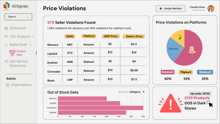
The Price Violations Dashboard helps brands maintain consistent pricing and monitor inventory availability, especially across multiple platforms and sellers. This allows brands to spot pricing inconsistencies at a glance.
This dashboard also includes valuable product availability metrics:
Out-of-Stock Data by Platform
Tracking out-of-stock instances across different sales channels highlights patterns in supply and demand.
Store-Level Availability with Regional Details
Each out-of-stock item by store location, including pin codes, provides a localized view of availability challenges.
If a product frequently sells out in a particular region, brands may redistribute inventory to address demand. Similarly, if a seller on Walmart prices a product significantly lower than other platforms, the brand can address this to maintain uniformity across channels.
This product data dashboard is essential for brands that want to ensure consistency across all sales channels, maintaining trust with customers by avoiding confusing price differences.
Email: sales@42signals.com
What are you waiting for?
Schedule a Demo with 42Signals Today to Unlock Advanced Insights and Strategic Advantages!
Schedule a Personalized Demo or Sign Up Now to see our services in action!

Empowering clients with smart insights for a better future. Get eCommerce insights on promotions, product stocks, and market trends. 42Signals equips consumer brands with rich data to turn customer insights into retail excellence.
COMPANY
RESOURCES
NEWSLETTER