** TL;DR ** A category heatmap is a powerful visual tool for e-commerce and retail strategy, color-coding market demand (search volume/sales) against competitive intensity (number of products/brands) to identify crucial category trends. The map’s core function is to distinguish between saturation (Red/Dark zones: high demand, high competition, low margin) and genuine opportunity (Growth Pockets – Green/Light zones: high demand, low competition, high margin). By using the heatmap as a niche finder to locate these “sweet spots” and long-tail demand pockets, businesses can strategically inform product development, shift marketing budgets away from costly, saturated high-demand items, and achieve profitable, sustainable growth by focusing on emerging products before the market catches up.
The digital shelf is constantly shifting, with consumer interests spiking and fading faster than ever before. If you’re managing an online store, overseeing a brand’s digital presence, or working in retail strategy, you know the pressure to stay ahead of the curve. The difference between booming sales and stagnant inventory often comes down to one thing: accurately identifying category trends.
But how do you move beyond guesswork and gut feelings? Enter the category heatmap—a powerful visualization tool that simplifies complex digital shelf analytics into an intuitive, color-coded map.
Think of it as a weather map for your market, highlighting the hot zones (high-demand items) and the cold areas (declining interest). We will break down what a heatmap shows, how to distinguish between market saturation and genuine opportunity, and how to use it to visualize fast-rising categories and, perhaps most excitingly, pinpoint those valuable long-tail demand pockets.
The Anatomy of a Category Heatmap—Visualizing Digital Shelf Analytics
A category heatmap is essentially a grid where rows and columns represent two different metrics—typically market demand (search volume or sales) and competitive intensity (number of products or brands).
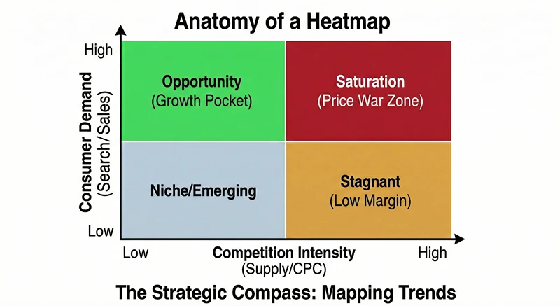
The individual cells within the grid are colored to indicate the density or intensity of the data point, creating a visual shortcut for understanding the overall category performance.
What the Colors Mean: Saturation vs. Opportunity
The color palette is the core language of the heatmap. While specific systems might vary, they usually follow a standard convention:
- Red (or Darker Shades): This area signals high activity. In most heatmap contexts, dark red means high demand and high competition. This is often where you find saturated markets or established high-demand items. While sales volume might be massive here, securing a decent market share can be prohibitively expensive due to intense bidding and already entrenched competitors.
- Green (or Lighter Shades): Green is generally the color of opportunity. It signifies high demand paired with low or moderate competition. These are the gold mines, representing growth pockets where consumer interest is strong, but the supply side has yet to fully catch up. This is where retailers can achieve higher margins and faster growth.
- Yellow/Orange: These transitional colors represent moderate demand and moderate competition. They are stable, reliable markets. They might not offer explosive growth, but they are crucial for maintaining a solid baseline of revenue and are often good places to test new product variations.
- Blue/Grey (or Very Light Shades): This usually indicates low demand and low competition. While it might seem like a niche finder’s dream, it often means the market for this particular category is either too small to bother with or simply hasn’t developed yet. Be cautious here—while some may be future emerging products, others are just products no one is looking for.
Deconstructing the Axes: Demand and Competition
Understanding the two main axes is key to interpreting category trends:
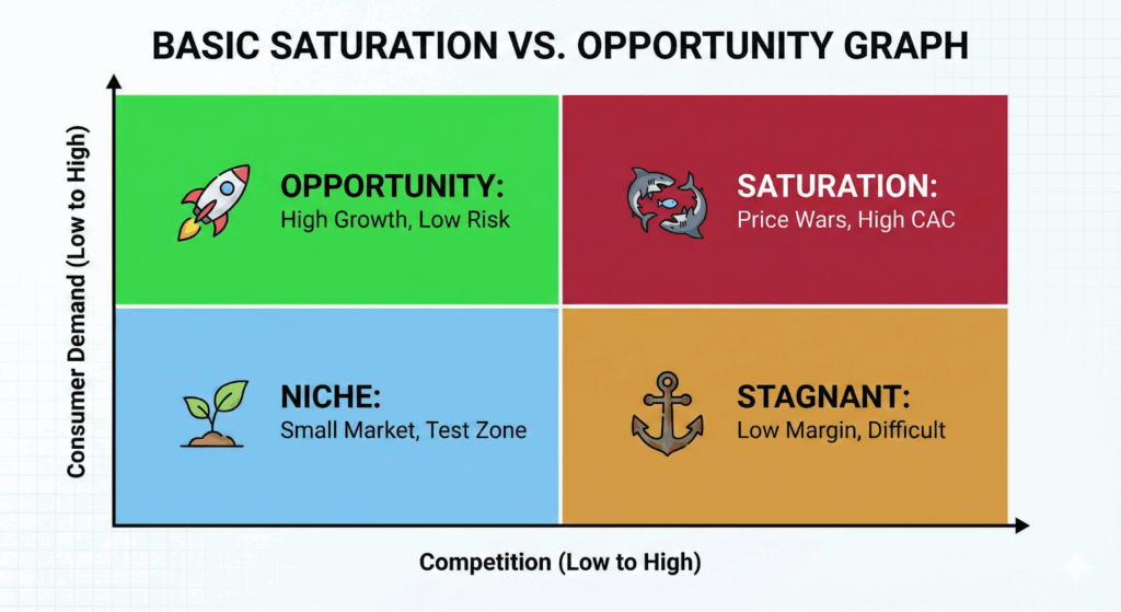
- The Demand Axis (Usually Vertical): This axis measures the consumer interest or volume. It is often calculated using metrics like the total search volume for relevant keywords, total sales within the category, or the number of units sold. When a category moves higher on this axis, it indicates greater consumer pull. For example, a high-demand category like “smartwatches” would sit high on this axis.
- The Competition Axis (Usually Horizontal): This axis measures the supply-side intensity. It is typically calculated using the number of listed products, the variety of brands present, or the average cost-per-click (CPC) for relevant advertising. Moving further along this axis signifies a more crowded market, which speaks to a level of saturation.
By plotting a category based on these two metrics, the heatmap immediately highlights whether a category is saturated (high on both axes, colored red) or whether it represents a real opportunity (high on the demand axis, low on the competition axis, colored green). This visual clarity is the power behind effective digital shelf analytics.
Identifying Market Saturation: The Red Flags of High-Demand Items
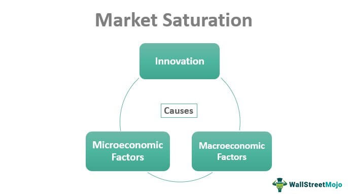
Image Source: Wall Street Mojo
Saturation happens when supply outstrips growth in demand, or when too many competitors are fighting over a finite number of customers. While high demand is tempting, diving into a saturated category without a significant competitive advantage is a recipe for low margins and high advertising costs.
The Pitfalls of the Red Zone
The biggest mistake retailers make when looking at category trends data is being drawn solely to the areas with the largest volume—the dark red cells. These high-demand items are attractive because they represent proven concepts and massive markets. However, the associated competition often negates the volume advantage.
Imagine a category on your heatmap that is extremely high on both the demand and competition axes, colored a deep crimson. This might be “basic wireless earbuds.”
- The Demand Reality: Yes, millions of people search for and buy these every month.
- The Competition Reality: You are competing against giants like Apple, Samsung, and hundreds of established private labels. Getting your product noticed requires aggressive and costly advertising campaigns, eating away at your profit per unit.
When faced with a red zone, ask yourself these crucial questions:
- Can I offer a 10x improvement? If your product is only marginally better or cheaper, it will fail to stand out. Only enter this zone if you possess a truly disruptive innovation.
- What is my customer acquisition cost (CAC)? In saturated markets, CAC soars. Use your digital shelf analytics to model the cost of attracting a single customer versus the potential lifetime value (LTV). If the ratio is unfavorable, move on.
- Do I have endless inventory and capital? Only brands with massive scale can truly thrive in fully saturated categories. For most businesses, this is the zone to avoid for new launches.
Reading Saturation Signals
A critical skill in how to read a category heatmap is spotting early saturation signs, even if the category is still somewhat green. Look for categories where:
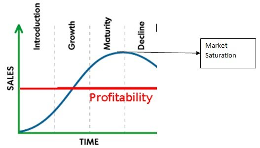
Image Source: MBA Skool
- The Competition Axis is Rising Quickly: If you analyze historical heatmaps, watch for categories that were once moderate but are now rapidly moving right. This indicates an influx of competitors, meaning the window of opportunity is closing, and the market is becoming saturated.
- Pricing Compression is Evident: While not directly on the heatmap, category performance data often shows average selling prices dropping rapidly, suggesting competitors are engaging in price wars to gain market share. This is a tell-tale sign of growing saturation.
- Generic Keywords Dominate: If the underlying keyword data shows searches are mostly generic (“buy shoes,” “cheap headphones”), it suggests a mature, undifferentiated market. True opportunity lies in specific, long-tail searches.
Pinpointing Genuine Opportunity: Visualizing Growth Pockets and Emerging Products
The true value of the category heatmap lies in identifying the “sweet spot”: areas with high consumer demand but manageable competition. These are the growth pockets where a new entrant or an existing brand expansion can quickly gain traction, market share, and strong margins.
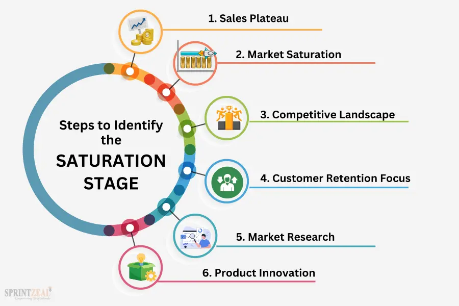
Image Source: Sprint Zeal
The Power of the Green Zone
The green (or light-colored) areas of your heatmap represent what are often called “Blue Ocean” segments—high potential, low competition. These are typically categories that are newly emerging products or niche segments of much larger markets.
When a category sits high on the demand axis but low on the competition axis, the message is clear: consumers are actively looking for solutions, but there aren’t enough products available to meet that need.
For example, a high-demand, low-competition quadrant might include:
- “Sustainable, modular furniture for small apartments” (A niche within the massive furniture category).
- “High-protein, vegan baking mixes” (A niche within the high-demand health food category).
- “Smart water bottles with tracking features” (A newly emerging product within the water bottle category).
Strategies for Unlocking Emerging Products
How do you use the heatmap to strategically capitalize on these growth pockets?
- Drill Down from the Green: Don’t stop at the colorful block. Use the heatmap as a guide to the underlying data. Click into the green cells to see the specific keywords and product variations driving that demand. For example, if “Vegan Supplements” is a green cell, the drill-down might reveal that “Vegan B12 Liquid Drops” is the specific emerging product driving the trend, pointing to a hyper-specific niche.
- Monitor Velocity and Acceleration: A category is a true growth pocket if its demand velocity is increasing rapidly. The heatmap often has functionality to show movement over time. A category that moves from the blue (low demand) to the bright green (high demand, low competition) quadrant in a short period (say, three to six months) is a hot trend waiting to be exploited.
- Cross-Reference with External Data: While the heatmap provides powerful internal digital shelf analytics, successful businesses cross-reference this with macro trends. For instance, if your heatmap shows a green light for “Outdoor Gear,” cross-reference this with a news report about rising interest in remote camping or hiking due to post-pandemic lifestyle shifts. This validates the trend’s staying power, confirming it is not just a temporary spike. According to a 2024 analysis by McKinsey & Company, businesses that systematically use digital demand sensing tools—like heatmaps—to identify emerging products see a revenue growth premium of up to 5% compared to their peers who rely on traditional forecasting methods.
By focusing on the green zones, you are positioning your business to ride the wave of genuine category trends before the market becomes oversaturated, allowing for profitable, sustainable growth.
The Niche Finder Strategy: Uncovering Long-Tail Demand Pockets
While the large green patches indicate significant, broad growth pockets, some of the most profitable opportunities are found in the overlooked corners of the map—the long-tail demand pockets. This is where the heatmap acts as a true niche finder.
What is Long-Tail Demand?
In e-commerce, the “long tail” refers to the vast number of specific, low-volume search queries that, when aggregated, make up a substantial portion of overall consumer demand. These are usually highly specific, multi-word search phrases (e.g., instead of “running shoes,” the query is “lightweight, waterproof trail running shoes size 10”).
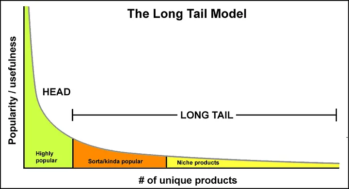
On a heatmap, these long-tail categories might appear in the lighter, less intense parts of the map, often near the middle, indicating lower overall demand than the big red categories, but crucially, still low competition.
Using the Heatmap as a Niche Finder
To use your heatmap to find these long-tail gems, focus your analysis on specific areas:
- The Moderate Demand, Low Competition Zone (Light Green/Yellow): This area might have categories that don’t look as explosive as the bright green zones, but they represent a stable, committed customer base. These niches are often too small for the massive brands to bother with, leaving them wide open for focused, specialist retailers. For a specialty retailer, focusing on 10 such niches can easily outperform competing in one massive, saturated market.
- Visualizing Micro-Trends: Long-tail demand often clusters around micro-trends driven by cultural shifts, new technologies, or specific demographics. For example, within the broad category of “kitchen appliances,” a micro-trend could be “air fryer accessories designed for small counter spaces.” Your digital shelf analytics tool should allow you to see the growth of specific, related keywords clustering together in this manner, showing you where the niche is forming.
The Advantages of the Long Tail
Targeting these long-tail category trends provides several critical advantages:
- Higher Conversion Rates: Customers searching for “rechargeable hand warmer for golf” are much closer to buying than someone searching for “winter gear.” The specificity of the search indicates high purchase intent, leading to higher conversion rates for the retailer that caters to it.
- Lower Advertising Costs: Since fewer competitors are bidding on these highly specific, long-tail keywords, your advertising costs remain significantly lower, contributing to higher profitability and a better LTV-to-CAC ratio.
- Easier Organic Rankings: It is far easier to rank organically (in search results) for a less competitive, long-tail phrase, making your brand discoverable without relying solely on paid advertisements.
This niche finder strategy, guided by a thoughtful reading of the heatmap, is the secret weapon for building a resilient e-commerce business focused on diverse, profitable growth pockets rather than relying on the volatile, high-stakes battlegrounds of saturated markets.
Understanding that every color and axis on the heatmap speaks volumes about consumer intent and market structure is the first step toward superior strategic planning.
Integrating Category Trends into Your Business Strategy
A category heatmap is not just a pretty graph; it is a strategic planning tool. Once you have identified those coveted growth pockets and confirmed the risk of highly saturated high-demand items, you need a plan to integrate these insights across your business.
Product Development and Sourcing
The most direct application of category trends analysis is informing what you decide to sell.
- De-risking New Product Launches: Instead of sourcing a product because it looks cool, you source based on validated demand in a green zone. For instance, if your digital shelf analytics highlight a strong, growing demand for “biodegradable packaging for pet food,” this should immediately trigger sourcing teams to find suppliers who meet this emerging demand, positioning you with a first-mover advantage. This significantly reduces the risk associated with introducing emerging products.
- Product Line Extension: Use the heatmap to identify adjacent niches. If your core category is doing well (yellow zone), look for related green or light-yellow cells. If you sell yoga mats, the heatmap might reveal a strong growth pocket in “eco-friendly resistance bands.” This guides a logical, profitable product line extension with minimal risk.
Marketing and SEO Strategy
Your marketing efforts should align precisely with the category trends identified on the map.
- Allocate Budget to Green Zones: Shift advertising budget away from hyper-competitive, red-zone keywords where conversion is expensive and toward the long-tail keywords identified in the green zones. Focus on creating highly targeted ad copy and landing pages for these specific emerging products and niches.
- Content Strategy as a Niche Finder: Use the low-competition, high-demand keywords as the foundation for your content strategy. If the heatmap points to “beginner mountain biking gear for women,” your blog should immediately prioritize articles, guides, and videos around that exact topic. By becoming the authoritative source for these highly specific growth pockets, you capture organic traffic before the major competitors notice the category trends.
Inventory and Pricing
Accurate reading of the heatmap can also optimize your operational decisions, especially for high-demand items.

- Inventory Buffering in Yellow/Green: Categories showing accelerating demand (moving toward green) require proactive inventory management. If you see a category performance metric indicating rapidly rising consumer interest, you should increase safety stock to avoid stock-outs, ensuring you can capitalize on the full potential of these emerging products.
- Strategic Pricing in Red Zones: For essential, saturated high-demand items that you must carry, use aggressive pricing strategies to capture volume, understanding that the margin on these might be lower. Your profits will be subsidized by the high margins achieved in the green and light-yellow growth pockets.
Category Heatmaps Can Help You More Than You Think
In summary, mastering how to read a category heatmap is about more than just data visualization; it is about embedding market intelligence into every aspect of your retail or brand strategy.
By systematically using the map to guide product, marketing, and operational choices, you ensure your business is always positioned to capitalize on current category trends and emerging consumer demands. It transforms uncertainty into clarity, turning complex digital shelf analytics into a straightforward roadmap for success.
The key is consistent monitoring and swift action based on the visual cues of saturation, opportunity, and new growth pockets. The digital world is constantly shifting, but with this tool, you will always be one step ahead, utilizing the heatmap as your primary niche finder and competitive edge.
Frequently Asked Questions
What is a category trend?
A category trend is a discernible, directional shift in consumer preference, market activity, or product attributes within a specific product or service category over a defined period. It represents the collective movement of demand and supply, indicating what consumers are increasingly seeking, what competitors are offering, and where future growth or decline is likely to occur. In the context of a category heatmap, it manifests as movement on the Demand and Competition axes, signaling potential saturation or opportunity.
What are the 5 types of trends?
While trend classification can vary, a common and comprehensive framework categorizes trends based on their scope, duration, and impact:
Macro Trends (or Mega Trends): Large-scale, transformative shifts that reshape global society, economics, and technology over decades. They influence multiple industries and drive fundamental behavioral changes. Examples: Digital transformation, demographic aging, sustainability/ESG, urbanization.
Market Trends: Significant, durable shifts occurring within a specific market or industry, typically lasting several years. They are often driven by Macro Trends but are confined to one sector. Examples: Shift to subscription-based services, remote work adoption, preference for plant-based diets.
Category Trends: The directional movements specifically related to product demand, competition, and features within a defined product category (e.g., the rise of smart home security devices within the electronics category). These are the focus of category heatmaps. Examples: Demand for smaller-batch artisanal goods, the integration of AI features into household appliances.
Micro Trends (or Fads): Short-lived, high-intensity spikes in interest that quickly gain popularity and often fade within a year or less. They typically impact small groups or specific consumer niches. Examples: A specific dance craze on social media, a temporary viral clothing style.
Perennial Trends (or Secular Trends): Long-term, enduring movements that become integrated into consumer behavior and market structure, often losing their “trend” label because they simply become the new normal. Examples: The continuous quest for convenience, the permanent shift toward online shopping.
What are the 5 stages of trends?
Trends typically progress through a life cycle that dictates their market penetration and potential for profitable engagement. The stages, though sometimes overlapping, are generally recognized as:
Emergence (or Latency): A trend begins with innovators and early adopters. Demand is low, competition is minimal, and the underlying concept may seem niche or eccentric. This stage is hard to detect but offers the highest potential reward for first movers (often found in the Blue/Grey zones of a heatmap).
Growth (or Acceptance): The trend begins to gain visibility, moving into the mainstream. Demand accelerates rapidly, and early profits attract the first wave of competitors. This is the Growth Pocket stage (Green Zone on a heatmap) where market share can be quickly captured.
Mainstream (or Peak Penetration): The trend reaches its widest adoption, embraced by the majority of consumers. Demand is at its highest, but competition is intense and often price-driven. This corresponds to the high-demand, high-competition Red/Dark zones on a heatmap, signaling approaching saturation.
Maturation (or Saturation): Growth plateaus or slows. The market is saturated with competitors, innovation focuses on marginal improvements or cost-cutting, and brands begin to exit or consolidate. This is the point where the trend transitions from an opportunity to a necessary operational category.
Decline (or Obsolescence): Demand steadily falls as a new, superseding trend or technology replaces the old one. This category moves toward the lower-demand, potentially still competitive zones, signaling a disinvestment phase.